Reflection
Over the course of the project it evolved from a picture book intended for younger children into a comic or graphic novel aimed at a slightly older audience. My aim was to create something that would entertain a wide audience with a light hearted story, exciting and sufficiently paced to engage. But as the story developed I realised I needed to also speak to an older, secondary but nonetheless important audience. In his essay The Narrative Construction of Reality Jerome Bruner describes the features of narratives and makes clear links to the ‘canon’ a reader brings with them. I therefore decided to tap into the pre-existing cultural knowledge of older readers, such as parents, through a humorous subverting of the established Star Wars canon. It became important to create something that operated on two distinct levels; one that required no pre-existing knowledge and another, wound into and through the storyline, that was activated by reference to popular culture.
In my proposal I had explained that first and foremost I wanted the book to be a good read and I am satisfied that the story of One and his defeat of Dr Doom is a well-constructed and engaging narrative. I have collected feedback from a broad cross section of audience ranging from 6 to 75 and whilst the very youngest and oldest found the lack of an explicit explanation from narration challenging, the feedback from the range 9 to 48 was largely positive and the understanding good. Its conventional 3 act structure (meet One/the mission/the demise of Doom) contains sufficient plot points and a twist to entertain and its popular culture references are amusing for older readers. However, in its current form it does not yet fully fulfil my aim of providing information about ADHD. The ‘complaints’ One is confronted with on page 25 are essentially the common ADHD traits I want to address but at the moment the book only highlights them. It does not achieve its stated goal of addressing and breaking down misconceptions associated with these traits. I have been corresponding with Dr Elin Davies, a psychiatrist, and this is something I intend to work on through the creation of an epilogue that addresses them more directly. That said ADHD is intended to be an important thread woven into the ‘rope’ of the story but it is not a story specifically about ADHD and not aimed at a narrow audience of those with it. By appealing to as wide as an audience as possible it can mediate its message to those that, it could be argued, really need it; namely the 96% without it and who don’t understand it.
I feel the design and appearance of the book is currently its main strength; in particular the application of Scott McCloud’s theories about comic abstraction. He explains there is a pictoral vocabulary in comics. A simpler cartoon is a symbol and close to the written word, it therefore exists in a conceptual world. The reader is given a symbol representing the character and a vehicle through which they travel through the story. Realistic drawing, on the other hand, gives the reader a visual solidity that makes it harder to get inside, to empathise with. He uses Herges’ Tintin as an example of the combination of these extremes. Tintin is a simplified cartoon, who exists in a very realistically drawn world and through which the reader navigates a very concrete real world. This is the reasoning behind the simple shapes and solid colours of One. I have also attempted to create a character the reader will sympathise with by using child or kitten like proportions; a large head in relation to torso, short limbs and big eyes.
Another design feature is inspired by Tom Harts book Rosalie Lightning. Written about the death of his daughter he utilises different drawing styles for different parts of the story. An expressive, dark drawing style for personal memories. A neat graphic style for the metaphorical stories told by the cartoon Tom within the story world. Equally influential has been the changing scale of panels used by Dave McKean in his book Cages. By using multiple small panels I am able to create smooth ‘action to action’ transitions (Scott McCloud, understanding comics.) Then larger, whole page panels create atmospheric ‘scene to scene’ and ‘aspect to aspect’ transitions. Through these it is also possible to control the pacing.
The one area of design I am not satisfied with is the text boxes. I choose to use type for the narration and handwriting for speech. This was influenced by Simone Lia and Tom Gauld’s work in Both but I remain unsure about it. Additionally the use of narration in the first act that then disappears is possibly confusing. I think the best narrator would a character, probably Despatchbot, as it tells the story. This would enable it to go on and in explain more about One’s different hard drive and to make a clearer link to ADHD.
I still have a lot to learn about these techniques but discovering them has opened up the possiblities of the world of comics. My experience as an animator has equipped me with strong and adaptable drawing skills but in terms of storycraft it had been limiting me to a very linear and explicit storyboard style. I still tend to over work and over explain the story and I hope to become confident enough to leave bigger gaps between the panels, and to leave more room for the readers imagination.
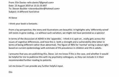
Feedback from Dr Elin Davies (MBBS FRCA MRCPsych)